You know what it’s like when you start renovating your place. You pop down to the paint store and spend an hour or more choose paint swatches, then you go back home and hold it up to the walls.
You’re unsure so you pop back out to the furniture and lighting store and on it goes and all of a sudden you’ve just replaced all the dishes in the kitchen as well.
That’s a little how it is with us right now. We’ve finished working under the hood with Fama Concordia (our Formula For Life digital guide) and so it’s onto the rest of the place.
We’ve got our Substack being audited right now, ready for renovation
We are heavily into the beta testing phase of the Alignment campus with hour hands deep into the web tech refinement phase of the Alignment Campus
The databases are being tested
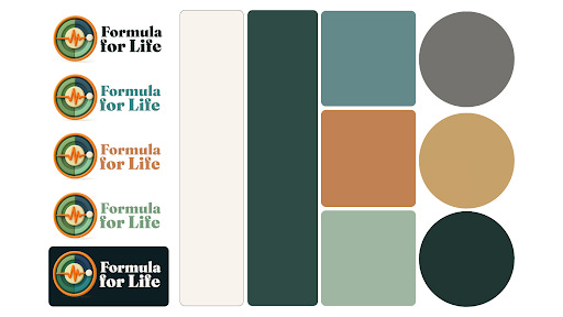
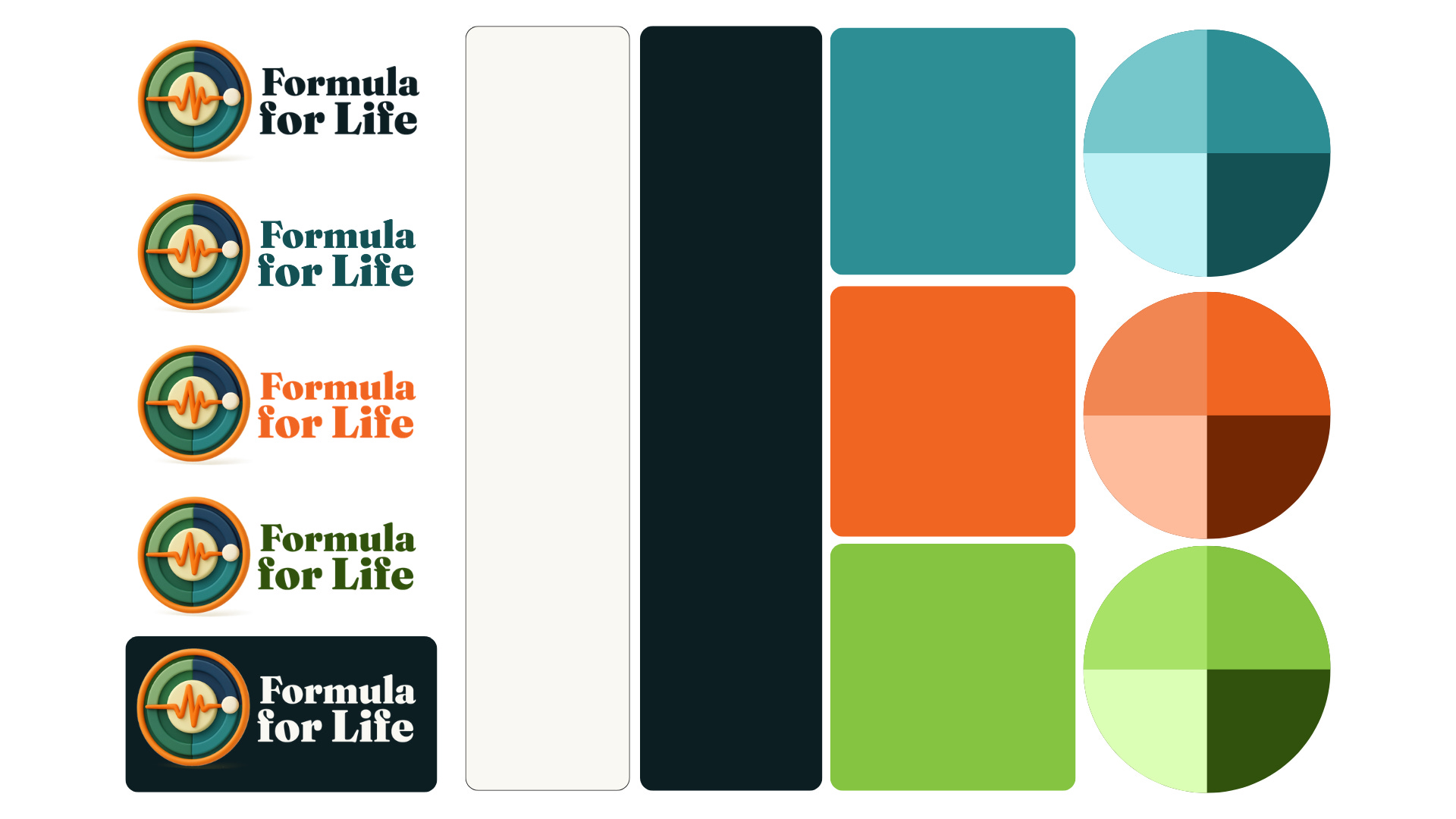
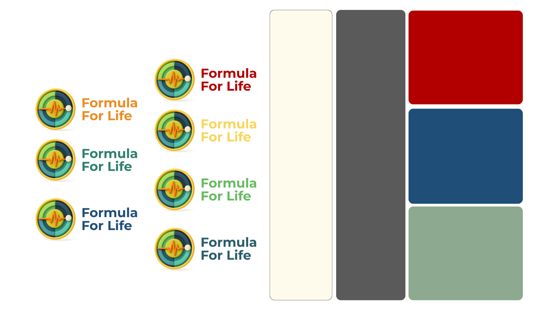
Now it’s time to start looking at “the decor” so I thought we would ask for your advice on your graphic design palette.
It’s important we get it right because it’s where you and I get together and hang out. It sets the mood and provides an environment to help Titans like you and I as professionals in mid to late career manage chronic illness.
Please choose your favourite graphic palette below then click on your choice in the poll. BTW, if you feel like commenting because you’de prefer to mix and match or offer suggestions, by all means please do in the comments of this post.